Shàn Yuán Brand Design
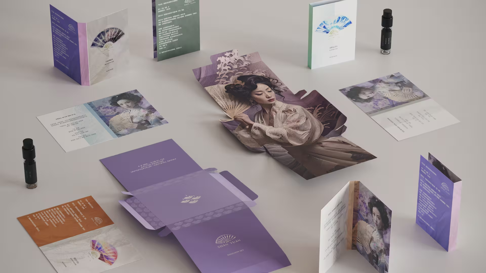
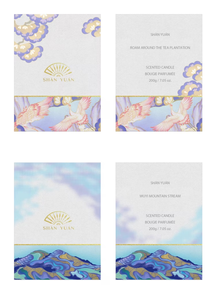
We were invited by SHÀNYUÁN to undertake a comprehensive brand identity upgrade that reinterprets its cultural roots and philosophical essence. The name “SHÀNYUÁN” is derived from the homonym of 善缘 (kind destiny), symbolizing the gathering of goodwill and positive connections — “扇源启扇聚源.” The new identity features two logo forms: a fan shape and a circular emblem, adaptable to various applications.

Our concept merges “fan” (扇) and “light source” (源) to embody benevolence and beauty from the East. The redesigned logo radiates from a central point, forming the ribs of a paper fan where light and shadow—yin and yang—intertwine, symbolizing harmony, balance, and perfection.

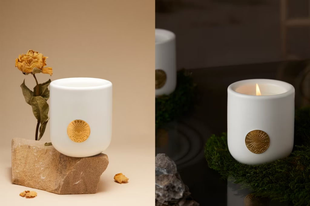
Inspired by the Eastern philosophy of “heaven as round, earth as square,” the circular mark integrates imagery of sunrise, sea of clouds, mountains, ocean currents, and fans, expressing the cyclical and ever-evolving balance of nature. Through this design, SHÀNYUÁN conveys an aesthetic of unity, continuity, and timeless oriental elegance.


Shàn Yuán Fragrance
Other

Fragrance Capsules Packaging Design
Other

Liang Studio Pavilion Design Shanghai
Interior